Synergy {round 2}

For the second year, I'm fortunate enough to work with  an awesome Utah company, Synergy Worldwide. Synergy is a worldwide company that markets nutritional and personal care products.  Last year they invited all the top performers to attend a celebratory vacation in Costa Rica.  This year it's Maui, Hawaii.

With the new venue came new color and layout choices.  We went with a new pattern and color for this year, Bloom.

The outer card is a 5x7 pocketfold in a classic Ecru and Aqua wrapped with a Kumquat band.  Upon opening you are greeted by a colorful and tropical themed invitation and accompanying inserts, including an RSVP, Agenda and Optional Activity card.  These are all put together in a Kumquat outer envelope.

This is the pre-cursor (and theme setting glance) to the 3D package that will be mailed out to all who RSVP in the next month.  Stay tuned for Part 2 of this colorful and fun corporate invite!

Emily's Invites

Emily was one of the FIRST people I met when I moved to Utah.  She's one awesome girl.  Beautiful, smart, ambitious - just the best!  So when she got engaged recently, I jumped at the chance to work on her invites!

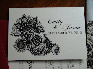
She wanted something that would set the tome for her black & ivory wedding.  The ONLY color will be brought out in the flowers.  Even the cake will have black fondant (who cares if the guests mouths will turn dark....makes for some great pictures :)  I love that Emily has a vision and doesn't let anything steer her away from achieving perfection!


Upon opening the metallic dark red envelope, out comes a champagne colored tri-fold card wrapped in METALLIC vellum.

The inside reveals a stunning pattern of black & champagne.  The inserts and accompanying inserts are on metallic ivory cardstock.
Included inserts are a directions card, with a detailed map and a ceremony invitation with a perforated RSVP postcard.  This is one of my favorite parts of this suite!  I've been wanting to design the tear-off element into an invite for SO long!  And it turned out awesome :)  YAY!  All the guests have to do is tear it off and toss it in the mailbox.  They retain the larger portion which has the vital details.  It still stacks perfectly behind the directions / map once the perforated section has been removed.

The back side of the RSVP postcard has a coordinating design with their names & date of the wedding.

 Their wedding will be elegant & fun - even more so for those that attend the ceremony as they will be riding the ski lift up to the top of the resort & taking the alpine slide back down to the dinner & reception!  Hopefully I've been able to put something together that is JUST what Emily & Jason were hoping for!  Thanks for trusting me to deliver your exciting message to the guests :)  Love you guys!

Mira's Birthday Invitations

It's that time again....back to school and lots of birthdays.  First is mine the middle part of August.  Two weeks later, it's Mira's (daughter #2) then 2 weeks later it's my dad, then 2 weeks later it's Lauren's (daughter #1), then Halloween, Thanksgiving, Christmas, Nolan (son #1), New Years & it's done....the second half of each year seems to FLY by!

Mira hadn't decided if she wanted to have an actual party for her birthday this year.  Turning 12 means you're getting older & can't do those little girl things you once did.  So, finally she decided it'd be fun for her to have a {camp out} with a few of her close friends here at our house.  So I threw together these invites in about 30 minutes, with things I had on hand (since there's no time to order papers in..):


it says:  "we'll be catching fireflies & putting 'em in jars, camping out in a tent underneath the stars..."
hence the "jar" artwork on the invites.  In the top 3 jars I added the month, day & year of the party in orange to highlight the metallic orange paisley mat under the invite, which is on a cream colored metallic paper.

So, no doubt we will be roasting hot dogs & making smores, having sleeping bag races and playing flashlight tag.  No jars, no fireflies...in fact, hopefully no bugs of ANY kind! :)

Estee's Invites

These are FOR CERTAIN the most colorful invites I've done yet.  Estee wanted her invites to give a FUN and modern introduction to her wedding.  Rather than use graphics or a theme, we used bright colors to set the stage!
The lime green metallic tri-fold card and orange mat under the invite set off the colors in the invitation itself. The invite was simple, clean and used the same font but in a variety of lower case, italic & caps to deliver the information.  Also included (not pictured) were several inserts for the ceremony in Denver, a second reception for Idaho family and yet another reception for Salt Lake family. Phew!

My favorite part of this suite was the envelope. Pulling this green invitation out of a HOT PINK metallic envelope with an ORANGE liner...screams FUN!  So enjoyed working with Estee & Blake!  Thanks for allowing me to  play a part in your special day! :) xoxo

Laura's Invites

Laura & her fiance have been so great to work with. We met the end of 2009 and have been gradually working on getting her wedding suite together.

She originally wanted a charcoal grey and this lighter orange shade called "Kumquat" but upon finalizing artwork she changed to a Platinum pocketfold. Wonderful choice!
We started with a 5"x7" Platinum outer pocketfold with a 2 layer seal, the underneath being the Kumquat color. These are all enclosed in an outer mailing envelope in the Kumquat color as well.

Inside we have a Kumquat mat with the main invitation on the left and in the right hand pocket are the RSVP, with the Kumquat return envelope, along with a directions insert and accommodation information. The simple floral motif gives just the right softness to the crisp platinum & orange colors.

Many thanks to Laura & Daniel. Hopefully these will set the stage for what is sure to be a beautiful event. I appreciate you allowing me to share in your joy!! Menus, programs, place cards and more exciting accompaniments will follow shortly.

Adrien's Invites

Adrien and Michael met with me nearly one year ago. They knew right off what they were looking for. The best part of that it made my job much easier since they are in TEXAS! The wedding was in Utah but the planning was all long distance.
We started with a 5"x7" metallic paisley lime green pocketfold style invitation. Sealing the package on the front is the double layer seal with a charcoal metallic mat and bright white top layer with their names.
The inside main invite mirrored the front seal in that it has the metallic charcoal mat & bright white with black printing.
The contents of the pocket are a postcard style RSVP, accommodation information and an agenda of the evenings festivities, with directions on the back.
Hopefully this suite will announce what's sure to be a stunning event at one of Utah's PREMIER settings, La Caille in Sandy! One of my favorites too! Stay tuned for more of this lime green & charcoal theme as I'm also providing menus, place cards and custom table names (instead of numbers) for the tables.


Brooke's Favors

Brooke ordered these cookies from Granite Bakery, the same place that made her cake. They were able to do these cute little flowers, in varying colors, to carry out the cherry blossom these of the wedding.
The tags are double sided with thank you and the signature sparrow from the invitation suite on one side and their names on the other.
I packaged them in cellophane bags with alternating dark red and chocolate brown ribbon to match. Hopefully these will please her guests visually as well as on the taste buds! :)